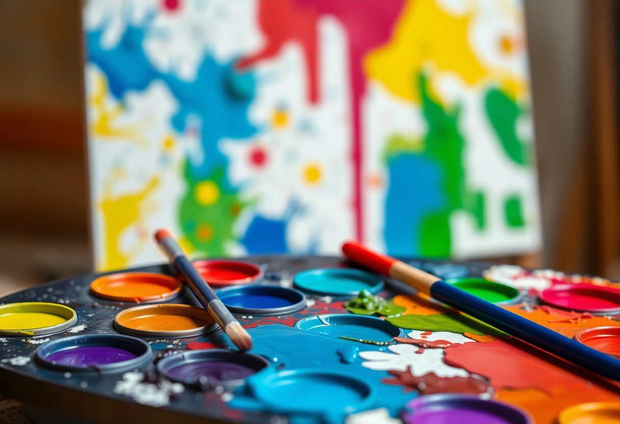
Many artists struggle with achieving the right color combinations in acrylic painting, which can lead to dull and lifeless results. In this post, you’ll discover vital techniques that will help you master your color palette and create stunning, vibrant pieces. By understanding the relationships between colors and utilizing specific mixing strategies, you’ll unlock the potential to enhance your artwork and elevate your skills. Dive in to learn how to transform your painting experience and achieve the vibrancy you desire.
Understanding Color Theory
The foundation of vibrant acrylic painting lies in a solid understanding of color theory. This knowledge helps you mix hues effectively, allowing you to create stunning compositions that grab attention. By exploring the principles of color, you can blend shades that elevate your artwork and evoke the desired emotions in your audience.
Primary, Secondary, and Tertiary Colors
Around the world of color mixing, primary colors—red, blue, and yellow—serve as the building blocks for all other hues. When mixed together, they produce secondary colors such as green, orange, and purple. By blending these secondary colors with primary ones, you create tertiary colors, enriching your palette for more sophisticated artworks.
Color Wheel and Relationships
Along your artistic journey, understanding the color wheel will greatly enhance your ability to mix colors and create harmonious compositions. The wheel visually illustrates the relationship between colors, helping you identify complementary, analogous, and triadic schemes to achieve dynamic results in your paintings.
Another important aspect of the color wheel is its illustration of color relationships. Complementary colors, located opposite each other on the wheel, create vibrant contrasts that can energize your artwork. Analogous colors, which sit next to each other, offer a sense of harmony and unity, perfect for creating cohesive themes. Furthermore, the triadic scheme combines three colors evenly spaced around the wheel; this helps maintain balance while adding interest. Understanding these relationships allows you to make informed mixing decisions and attain striking results in your acrylic paintings.
The Importance of Undertones
Now that you’ve grasped the basics of color mixing, understanding the significance of undertones can transform your acrylic paintings. Undertones are the subtle hues that lie beneath the surface color, shaping the overall ambiance of your work. By considering these underlying tones, you can enhance color harmony, create mood, and achieve truly vibrant results in your artwork.
Warm vs. Cool Colors
Among the most important aspects of undertones is the distinction between warm and cool colors. Warm colors, such as reds and yellows, evoke feelings of energy and warmth, while cool colors like blues and greens bring calmness and serenity. By mastering the balance between these two types, you can effectively manipulate the emotional tone of your painting.
Creating Depth with Undertones
An effective way to add depth and dimension to your work is through the careful selection of undertones. By mixing warm and cool undertones, you can create a more complex color palette that adds visual interest. For example, using a warm undertone beneath a cooler color can make your subject appear more vibrant and alive, adding significant depth to your artwork.
Importance lies in recognizing how undertones influence your overall color scheme. Using warm undertones to contrast with cooler shades can create striking effects, making elements appear to recede or advance in space. This technique not only enriches your palette but can also enhance emotional connections in your artwork. Experimenting with various combinations allows you to uncover the unique personality of your colors, ensuring your paintings are not only vibrant but also visually captivating.
Mixing Techniques for Acrylics
Some effective mixing techniques can elevate your acrylic painting to the next level. Understanding how to blend colors on your palette and directly on the canvas allows for dynamic results. Experimenting with these techniques will help you achieve a vibrant range of shades and tones, enhancing the overall visual impact of your artwork.
Palette Mixing vs. Direct Painting
Beside the fun of blending on the palette, direct painting involves applying colors straight onto the canvas, allowing for spontaneity. While palette mixing offers a consistent outcome, direct painting can create lively interactions between colors that can lead to unexpected, beautiful results. Balancing both methods in your practice can expand your technical skills and artistic expression.
Using Glazes for Vibrancy
By incorporating glazes into your acrylic work, you unlock a world of depth and vibrancy. Glazes are thin layers of transparent color applied over dried paint, allowing light to pass through and reflect off the underlying layers. This method not only enhances the luminosity of your work but also creates intricate, visually appealing effects.
Even a thin application of transparent acrylic can bring about a stunning transformation. The layering process allows your underpainting to shine through, producing a richness in color that cannot be achieved with heavy applications alone. Using glazes thoughtfully can add complexity to shadows and highlights, making your artwork feel alive and dynamic. Be mindful of drying times, and always test your colors to ensure that overlays enhance rather than muddy your vision.
Building Your Color Palette
Once again, creating a vibrant color palette is vital for expressing your artistic vision in acrylic painting. Start by selecting colors that harmonize well together, as this will contribute to a cohesive artwork. Consider variations in temperature and hue, which can affect the mood of your piece. Experiment with different combinations, and don’t hesitate to swatch your colors to see how they interact on the canvas before making a final decision.
Essential Colors for Every Painter
Among the primary colors, a solid selection of vital colors forms the foundation of your palette. Opt for a basic set including Titanium White, Mars Black, Cadmium Red, Ultramarine Blue, Cadmium Yellow, and Burnt Umber. These colors offer a vast range of mixing possibilities and will allow you to create virtually any shade you desire, enabling endless creativity.
Customized Palettes for Unique Projects

After mastering the vitals, consider personalizing your palette for certain projects. Tailor your selection based on the themes, styles, and emotions you intend to convey in your artwork. This customization opens up new avenues for exploration and creativity, making each painting uniquely yours.
Due to the flexibility of acrylics, customized palettes can elevate your projects significantly. By choosing specific colors that align with your artistic intent, you not only enhance the visual coherence of your work but also add depth and meaning. For instance, using warm colors can evoke emotions like energy and warmth, while cool colors can create a sense of calm and serenity. Pay attention to your subject matter and personal style to design a palette that truly represents your vision, ultimately leading to more personal and impactful artwork.
Tips for Achieving Vibrant Results
Many artists strive for vibrant results in their acrylic paintings, and to achieve this, consider the following tips:
- Use high-quality acrylic paints
- Mix colors on a palette rather than directly on the canvas
- Employ a limited color palette to enhance vibrancy
- Use glazes to create depth and luminosity
- Incorporate white strategically for lighter shades
After applying these techniques, you’ll notice an exciting boost in the vibrancy of your artwork.
Layering Techniques
On your journey to create vibrant acrylic paintings, mastering layering techniques is crucial. By applying multiple thin coats of paint, you can build depth and luminosity, allowing the underlying layers to influence the topmost ones. Remember to let each layer dry completely before adding the next to avoid muddiness, ultimately creating a rich, harmonious palette.
Maintaining Clean Colors
On the path to achieving vibrant results, it’s vital to maintain clean colors in your work. This can be done by keeping your palette tidy, regularly cleaning brushes, and using separate tools for each color. Avoid mixing too many colors at once to prevent unwanted grays and muddy tones.
Also, using a color wheel can help maintain clarity in your palette. By understanding color relationships, you can select complementary shades that enhance each other rather than conflict. Utilize clean brushes and water when necessary, always rinsing between colors. This practice ensures that your hues remain pure and vibrant, leading to striking results in your acrylic paintings.
Common Mistakes in Color Mixing
Keep your color palette vibrant by avoiding frequent mistakes in color mixing. Beginners often overlook the fundamental principles that can lead to beautiful blends. By understanding these common pitfalls, you can enhance your acrylic painting techniques and achieve the results you desire. From muddied hues to disregarded values, recognizing these setbacks can significantly elevate your artistry.
Over-Mixing and Muddy Colors
The tendency to over-mix your colors can lead to a muddy palette that lacks vibrancy. When you blend your colors excessively, you strip away their individual characteristics, resulting in dull and lifeless shades. Aim to mix just enough to create a harmonious blend while retaining sufficient distinct color attributes for a lively composition.
Ignoring Color Value
Color value plays a significant role in your painting’s depth and contrast. When you neglect to consider value, your artwork may lack dimension, leading to flat and uninviting visuals. A balanced range of light and dark shades creates a captivating atmosphere that draws the viewer in. By understanding how to manipulate color value, you can enhance the depth and impact of your artwork, ultimately achieving a more dynamic and engaging piece.
A strong understanding of color values enables you to manipulate light and shadow effectively. When you incorporate a variety of values within your palette, you enhance visual interest and lead the viewer’s eye throughout your painting. Using contrasting values can make certain elements pop, while understated values can subtly enrich your artwork. Prioritize exploring value in your color mixing, as it can transform an ordinary piece into something truly remarkable.
To wrap up
From above, understanding the art of color mixing in acrylic painting can significantly enhance your results. By experimenting with primary colors and employing techniques like glazing and layering, you can create vibrant effects that bring your artwork to life. Utilize your palette wisely and explore complementary and analogous color schemes to find the perfect balance. Embrace your creativity and don’t hesitate to refine your approach as you discover what resonates with your personal style. With these tips, you are well-equipped to elevate your acrylic paintings and make a lasting impression.
FAQ
Q: What are the basic color mixing principles for acrylic painting?
A: When mixing colors for acrylic painting, start with the primary colors: red, blue, and yellow. By combining these colors, you can create secondary colors: green, orange, and purple. To achieve various shades and tones, adjust the color mixture by adding white for lighter shades or black/brown for darker tones. Experimenting with different ratios will help you understand how colors interact and influence each other, ultimately leading to more vibrant and dynamic results.
Q: How can I achieve a vibrant color palette in my acrylic paintings?
A: To obtain a vibrant color palette, use high-quality acrylic paints that have strong pigmentation. Start with just a few primary and secondary colors, and mix them on your palette to find combinations that resonate with you. Avoid over-mixing, as this can muddy colors; instead, dab and swirl the colors on the canvas for a more lively effect. Consider using complementary colors (opposite each other on the color wheel) to create contrast, which will make colors appear more vivid.
Q: What techniques can enhance color mixing in acrylic painting?
A: Techniques such as glazing, layering, and wet-on-wet can significantly enhance color mixing. Glazing involves applying a transparent layer of paint over a dry base, which allows the underlying colors to show through and adds depth. Layering different colors can create complex visual textures, while wet-on-wet mixing allows colors to blend directly on the canvas, resulting in softer transitions. Experimenting with these techniques will help in achieving rich color combinations.
Q: How do I prevent colors from becoming muddy when mixing?
A: To avoid muddy colors, work with clean brushes and palettes, and be mindful of the colors you’re combining. Mixing too many colors or adding too much paint can lead to dull tones. Instead, limit the number of colors in each mix and consider the color wheel—mix only colors that are close together on the wheel to maintain vibrancy. Additionally, try mixing colors in small amounts before committing to larger applications on your canvas.
Q: Can I use additives to improve color mixing with acrylics?
A: Yes, additives such as acrylic mediums can enhance your color mixing experience. Adding a flow or matte medium can increase the transparency of your colors, allowing for more nuanced mixing and layering. Glazing medium can produce luminous effects, while slow-drying mediums can give you additional time to work with the paint before it dries. Exploring these products will provide you with more options and techniques to create vibrant results in your acrylic paintings.