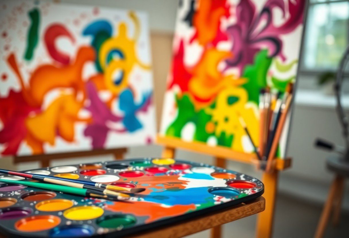
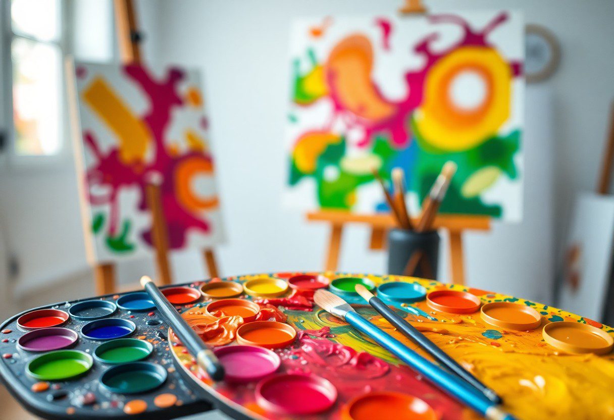
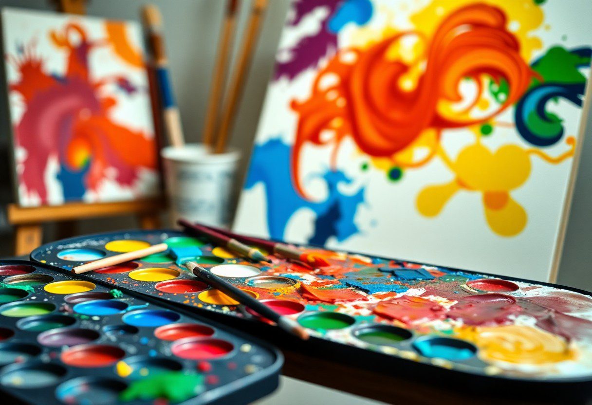
Vibrant hues can transform your artwork, breathing life into every canvas. By mastering color theory, you can elevate your artistic skills and create stunning visual compositions that captivate your audience. Understanding the relationships between colors, such as complementary, analogous, and triadic schemes, allows you to evoke specific emotions and enhance the overall impact of your work. In this blog post, you will discover vital techniques and tips that will empower you to manipulate colors effectively, ensuring your art stands out in a crowded space.
Understanding Color Theory
While exploring the vibrant world of art, you must grasp the fundamentals of color theory. This knowledge equips you to make informed decisions about color selection and application in your artwork. Understanding the properties of colors, how they interact, and their psychological effects will enable you to evoke specific emotions and create more compelling visual narratives in your art.
The Color Wheel
After familiarizing yourself with the basics of color theory, you will encounter the color wheel. The color wheel is a visual representation of colors arranged in a circular format, showing the relationships between primary, secondary, and tertiary colors. This structure can help you understand color mixing and choose effective color combinations that enhance your artwork.
Color Harmonies
After mastering the color wheel, you can explore color harmonies, which are combinations of colors that create a pleasing visual effect. These harmonies help you establish mood and balance in your compositions, whether you’re aiming for a vibrant, energetic piece or a calming, serene atmosphere.
Plus, understanding color harmonies opens up a world of creative possibilities in your art. You can experiment with complementary, analogous, and triadic schemes to find combinations that resonate with your artistic vision. By leveraging the impact of color harmonies, you can dramatically enhance the emotional depth and visual appeal of your works, making your art more engaging for your audience.
The Psychological Impact of Color
Some colors evoke strong emotions and influence your mood and behavior in significant ways. Understanding the psychological impact of color is important for creating vibrant works that resonate with your audience. When you incorporate color effectively, you can enhance the storytelling, convey deep emotions, and create a lasting impression in your art.
Emotions and Color Perception
Emotions play a vital role in how you perceive color. Warm colors like red and yellow can evoke feelings of excitement and energy, while cool tones such as blue and green tend to instill calmness and tranquility. By thoughtfully selecting colors, you can manipulate the viewer’s emotional responses, ultimately enhancing the message of your artwork.
Cultural Significance of Color
An understanding of color’s cultural significance can deepen your art’s impact. Different cultures attach unique meanings to colors, which may vary widely around the world. For instance, in Western cultures, white is often associated with purity and new beginnings, while in some Eastern cultures, it symbolizes mourning. By acknowledging these cultural associations, you can create more meaningful connections with your audience and avoid unintended misinterpretations.
Cultural interpretations of color have strong implications that can either enhance or detract from your work. Red might signify danger in some cultures, while in others, it embodies love and celebration. Understanding these nuances empowers you to make informed color choices and enriches your storytelling. Additionally, by being aware of the cultural significance behind color, you demonstrate sensitivity and respect toward diverse traditions, allowing your art to reflect inclusivity and depth.
Color Mixing Techniques
Clearly, understanding color mixing techniques can vastly enhance your artistic creations. By mastering how colors interact with each other, you can achieve a vibrant palette that resonates with viewers. Mixing colors correctly can bring depth and dimension to your artwork, allowing for more expressive and dynamic pieces. In this chapter, we will explore the fundamental types of color mixing, giving you the tools to elevate your color use in artistic practice.
Additive vs. Subtractive Mixing
On a basic level, additive mixing involves combining light to create colors, while subtractive mixing relies on combining pigments. Additive mixing occurs when colors, such as red, green, and blue light, blend to produce white light. Conversely, subtractive mixing uses primary colors—cyan, magenta, and yellow—where blending creates darker colors, ultimately resulting in black. Understanding these concepts will empower you to select appropriate techniques in your work.
Practical Mixing Tips for Artists
Between colors you wish to mix, it’s important to follow some practical tips to ensure your vibrancy. Start with a palette that allows for easy mixing and use a palette knife for better blending. Be conscious of your color ratios; using a small amount of a contrasting color can create striking effects. Experiment with layering techniques to add depth to your work. Keeping a mixing journal will help you track what combinations work best. Assume that these practices can significantly improve your color mixing abilities.
In addition to those tips, consider your workspace and how it influences your color choices. Ensure you have good lighting; different types can affect how colors appear. Keep your paints and tools organized for easy access, which promotes experimentation. Visualize the final result as you mix colors; this mental image will guide your choices towards achieving remarkable harmony and contrast. Assume that by refining these techniques, you will unlock a more vibrant and cohesive artistic expression.
Creating Contrast and Depth
Not every artwork needs to be filled with vibrant colors to make a statement. By implementing contrast and depth, you can direct attention and create a focal point in your composition. Utilizing light and shadow, along with varying color temperatures, will enhance the perception of three-dimensionality while drawing your viewer’s eye to specific areas. This layered approach offers a rich, engaging experience without overwhelming the observer.
The Role of Light and Shadow
Against a flat surface, light and shadow play an vital role in establishing mood and dimension. They can encourage the viewer to explore your artwork more closely, as they help define edges and shapes. Strategically placed shadows add intrigue and drama, while highlights can evoke feelings of warmth and openness. Understanding how to manipulate these elements will significantly elevate your work.
Utilizing Complementary Colors
Depth can be achieved by incorporating complementary colors into your palette. When you place colors opposite each other on the color wheel, they create a vibrant contrast that draws the eye. Not only do these contrasting hues intensify one another, but they also help you highlight focal points within your composition.
Light and shadow, combined with complementary colors, serve as vital tools in your artistic arsenal. Using them effectively can transform your artwork from mundane to mesmerizing. Consider pairing a warm yellow with a cool purple or a vibrant red with a calming green. These juxtapositions will not only add vibrancy but also create an optical effect that enlivens your piece. Embrace the balance and excitement that complementary colors can bring, allowing you to create artwork that resonates with your audience long after they’ve walked away.
Application of Color in Different Mediums
To create vibrant works, understanding how color functions across various mediums is necessary. Each medium possesses unique qualities that can dramatically influence the appearance and emotional impact of your artwork. Whether it’s paint, pencil, or digital tools, mastering the application of color helps you convey your artistic vision effectively and engage your audience.
Painting and Drawing
Before you begin your painting or drawing, consider the impact of your color choices on composition and mood. Utilizing a well-thought-out color palette can set the tone for your piece, whether you’re aiming for harmony or contrast. Exploring various techniques like blending, layering, or glazing can enhance the vibrancy of your colors and elevate your artwork.
Digital Art and Design
Application of color in digital art and design offers a vast array of options for exploration and experimentation. The flexibility of digital tools allows you to manipulate colors easily, adjust transparency, and seamlessly blend hues, resulting in dynamic visuals. Using color gradients, adjustment layers, and saturation controls can help you achieve the desired vibrancy while maintaining the work’s integrity.
Further, understanding color theory principles in digital art can enhance your creative process. Relying on the RGB color model allows for a vibrant color spectrum, while techniques like layer blending modes can create depth and interest. By experimenting with color combinations and contrasts, you can develop captivating designs that resonate emotionally with your audience, making your digital artworks stand out in today’s visual landscape.
Advanced Color Techniques
Keep exploring new methods to enrich your art with advanced color techniques that elevate your creations. Consider the following:
- Understanding color harmonies
- Implementing complementary colors
- Exploring the color wheel dynamics
- Utilizing color temperature effectively
- Experimenting with unusual color palettes
| Technique | Description |
|---|---|
| Glazing | Applying transparent layers of color. |
| Layering | Building depth through multiple paint applications. |
Glazing and Layering
On mastering the techniques of glazing and layering, you can significantly enhance the depth and richness of your artwork. This method allows light to penetrate through the top layers, creating an optical illusion of luminosity that captivates the viewer.
Textures and Patterns
Behind the scenes, incorporating textures and patterns can transform your artwork by adding an element of surprise and intrigue. Experimenting with various surface techniques enriches your color application, enhancing visual interest.
In addition to the visual appeal, textures and patterns can greatly influence the emotional response to your art. Incorporating different materials, such as fabric or natural elements, allows you to create unique tactile experiences. Whether you’re using a palette knife to add dimension or seamlessly blending textured papers, your work gains a distinctive character that engages the viewer’s senses. Pay attention to the balance of rough and smooth elements to maintain harmony within your composition.
Conclusion
With these considerations, you can effectively apply color theory to enhance your artistic creations. By understanding the relationships between colors, their emotional impacts, and the techniques to blend and contrast effectively, you can transform your works into vibrant expressions of your vision. Embrace the power of color and experiment freely; your mastery of these principles will lead to more impactful artistry that resonates with viewers and elevates your skills as an artist.
FAQ
Q: What is Color Theory and why is it important for artists?
A: Color Theory is a set of principles used to understand how colors interact and how they can be combined to create harmonious and aesthetically pleasing works of art. For artists, a strong grasp of Color Theory can enhance their ability to convey emotions, set moods, and create depth in their creations. It allows artists to make intentional color choices that elevate their artwork, making it visually striking and engaging for the audience.
Q: What are the primary colors, and how do they relate to color mixing?
A: The primary colors are red, blue, and yellow. These colors cannot be created by mixing other colors together. When combined, primary colors can produce secondary colors: red and blue create purple; blue and yellow create green; and yellow and red create orange. Understanding this mixing process is vital for artists because it forms the foundation for creating a full spectrum of colors and allows for greater creativity in color application.
Q: How can artists use color to evoke emotions in their artwork?
A: Artists can use color to evoke emotions by implementing specific color associations tied to cultural meanings and psychological responses. For instance, warm colors like red and yellow often convey warmth, excitement, or anger, while cool colors like blue and green can evoke calmness or serenity. By thoughtfully choosing a color palette that aligns with the desired emotional tone, artists can more effectively communicate their message and connect with viewers on a deeper level.
Q: What role does contrast play in color composition?
A: Contrast in color composition is vital as it helps to create visual interest and draw attention to specific elements within an artwork. High contrast can make certain features pop, leading the viewer’s eye to significant areas of focus. On the other hand, low contrast can result in a more subdued composition, perfect for creating harmony and tranquility. Understanding how to balance contrast allows artists to direct the viewer’s attention strategically throughout their work.
Q: Can you explain the concept of color harmony and its types?
A: Color harmony refers to the pleasing arrangement of colors within an artwork, creating a sense of unity and balance. There are several types of color harmony, including complementary (using colors opposite each other on the color wheel), analogous (using colors next to each other), and triadic (using three colors evenly spaced around the wheel). Each type of harmony can create different visual effects and atmospheres, and artists can experiment with these combinations to achieve desired outcomes in their pieces.